Animated Horizontal Bar Chart in D3
Today we’re going to be creating an animated horizontal bar chart in D3.js. D3 is a bit overkill for such a simple chart but once your requirements become even slightly complex, you’ll be glad you chose such a flexible library.
As with most of my posts, I’m going to be using Vue.js for this chart. There are plenty of examples out there for how to create basic visualizations in D3 but I think it’s useful to show how to use current frameworks to make the task easier. And the final product is much more likely to follow software “ilities” than anything using just D3.
Just in case you can’t see the embedded JSFiddles, here is the full horizontal bar chart example.
Data
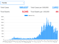
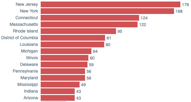
For this bar chart, I’ve chosen to highlight some rarely-cited information regarding the current coronavirus pandemic. Mainstream news outlets are hyper-focused on case rates between states as a gauge of how well a state has responded to the health crisis. Unfortunately, state population is rarely cited as a reason for the massive differences in case rates. As with so many things during this pandemic, the presentation of case rate data has become politicized and highly dependent on who is doing the reporting.
Just a heads up, it can be dangerous to take per capita statistics like what I’m presenting here at face value. Our World in Data does a great job describing the limitations of interpreting case fatality rates. That being said, comparing the fatality rate between states can be a useful counterpoint to the overall case/death per state rates cited more regularly. I’ll leave the analysis to you but it’s clear that taking population into account changes the narrative quite a bit.
Using population estimates from the US Census Bureau and the number of Covid-19 cases/deaths per state on July 24th from Johns Hopkins University, I first constructed a JSON of the coronavirus data I cared about. Specifically:
{
  "state": "Florida",
  "cases": 402312,
  "deaths": 5653,
  "population": 21993000
}
The Chart
The main Vue.js template (in the fiddle’s HTML) is used for the main components of the chart. That is, the rectangles (bars) used for each state and the svg container for the D3-controlled vertical axis.
The JavaScript contains all the Vue.js components used to generate the chart. Check out the comments for how each component works.
And just a bit of styling:
Result
And here you have it, a horizontal bar chart using D3 and Vue. A few ideas on how to make this even more interesting:
- Use the reactivity of D3 to animate the position of the states when changing to a different data point (e.g. total cases)
- Grab some coronavirus time series data and animate changes to the death rate over time