Using Geocoded Property Sales Data to Inform Real Estate Investment Decisions
The Problem
Understanding trends in local real estate markets is practically a requirement for making money regardless of a real estate investor’s niche. Specifically, understanding a neighborhood’s property values as compared to both its own history AND that of surrounding neighborhoods allows an investor to decide whether they should invest in an area or not.
Currently Available Free Tools
Data aggregators such as Zillow and Trulia do a decent job of giving you a snapshot of current real estate market data. In the case of Zillow, you can even get a black box prediction for how individual properties or neighborhoods might change and how that compares to the overall city. But even map happy providers like Trulia fall short when trying to convey how neighborhoods (emphasis on the plurality) are changing. For example, Zillow often informs me they have predicted home values in zip codes I invest in to increase X% over the next year. If I focused on appreciation (not investing), I might just take that number at face value but as an investor who wants to continue acquiring properties for the foreseeable future, what I really want to know is what does that mean in the context of ALL the neighborhoods in the metropolitan area I invest.
The reason any of this is helpful in real estate investing is because a sharp rise or fall in an established neighborhood could clue me into some fundamental change taking place. And if I use that data along with supporting information (e.g. change in available employers, demographics, transportation options, etc.) I can feel confident in my decision to either invest or hold off on investing in a particular neighborhood.
Custom Solution
Since no free tools exist for this purpose, this is where doing data collection of our own can help. The most important source of information is the website for your local municipal office responsible for publishing sales data. This is where things get complicated. Rarely is this data available for bulk download much less a nice API for a developer to freely use. This explains why companies make big money on selling this public information back to the public. In my case (Baltimore, Maryland), there is a pretty decent website available but the terms of use strictly forbid any form of automated scraping of their data. Since I intended to use data for this article, I spent an embarrassing amount of time compiling sales data manually.
Property Sales Data
In my case, all of the data is for a single city (Baltimore), so the street address is all I needed for this projet. Which is a good thing because the site for this information doesn’t provide more than the street address without navigating to a new page (a couple orders of magnitude more effort).
date        address             price
2019-02-01  743 S LINWOOD AVE   572500
2019-02-01  215 S ROBINSON ST   212000
2019-02-01  1741 E FEDERAL ST   7000
2019-02-01  2217 BELAIR ROAD    75000
2019-02-01  714 GORSUCH AVE     278000
2019-02-01  3140 ELLERSLIE AVE  155000
2019-02-01  1735 MONTPELIER ST  27000
2019-02-01  419 W 28TH ST       110000
2019-02-01  3665 CHESTNUT AVE   379500
2019-02-01  3813 PLEASANT PL    104900
Geocoding
To be able to plot this information on a map, I knew I would need to get at least a rough latitude and longitude for each address above. That process is known as geocoding. There are a bunch of services out there which provide this functionality but most either cost money for even the small workload I needed or they require all kinds of attribution including using their own proprietary mapping system to show the data you’ve collected (hello, Google Maps platform). In the end, I learned that the good ol’ US Census Bureau has a completely free API for this which has no limits that I’ve found. I limited my queries to the Census’ Geocoder to only what I actually needed because that’s just how I roll but it’s still nice to know I could get more if my needs changed. I’ll save the details of how to use that API for another post, but here is what I ended up with:
address             lat        long
743 S LINWOOD AVE   39.283806  -76.57565
215 S ROBINSON ST   39.289772  -76.57244
1741 E FEDERAL ST   39.308617  -76.59356
2217 BELAIR ROAD    39.316597  -76.57946
714 GORSUCH AVE     39.327114  -76.60621
3140 ELLERSLIE AVE  39.325687  -76.60471
1735 MONTPELIER ST  39.319492  -76.59473
419 W 28TH ST       39.32027   -76.62348
3665 CHESTNUT AVE   39.332455  -76.62947
3813 PLEASANT PL    39.33451   -76.63219
Mapping the Data
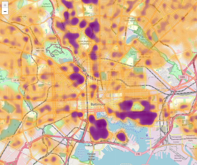
What I wanted to do was overlay a map with some type of indicator of how property values were changing. A heat map was an obvious method for doing this. As with finding a good geocoding API, it took a while to find a mapping library and a complementary heat map component. I ended up using Leaflet for the maps and a plugin called Leaflet.heat for the property value visualization.
Now before I even tried to plot the data on the map, I realized I was going to need to reduce the amount of points I fed it. There are currently about 20,000 sales in Baltimore City each year. Although Leaflet.heat can handle that much data with relative ease, I don’t like the idea of a browser having to load more than necessary. My solution was to do a simple averaging of the sales within a lat/long based grid. That is, I divided up all the sales within the city using a grid .001 latitude degrees high and .001 longitude degrees wide and took the average for each psuedo-square and stored it as the grid’s center lat/long. Psuedo because this doesn’t really create squares. Since longitude lines (the vertical ones when looking at a map) converge at the poles the grid I created would be very much skewed near the poles. For my purpose this was fine both because Baltimore is far from the poles and great precision was unnecessary.
lat long price
38.9615 -76.4875 140166
39.2005 -76.5685 154000
39.2175 -76.4795 435000
39.2175 -76.4805 219000
39.2215 -76.5875 23000
39.2215 -76.5885 37000
39.2215 -76.5945 18000
39.2225 -76.5875 20520
39.2225 -76.5885 56100
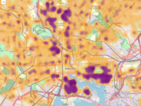
39.2225 -76.5895 37500And below is what that data looks like on a map. The orange (Orioles ;)) represents lower average property and the purple (Ravens ;)) represents higher average property values. I chose this type of diverging gradient palette because my goal was to accentuate changes rather than specific values; some of the highest quality areas in the city have low average property values because of the large number of condos. Again, it’s the changes we really care about visualizing.

Pretty awesome looking and I can tell you from experience that within a few seconds of looking at that map, you can learn some things even long-time investors may not know. I’ve been investing in Baltimore for several years now and I was definitely caught by surprise on a couple of the neighborhoods I don’t usually focus on. That’s the power of this type of visualization.
Changes Over Time
Going back to the start of this article, I said what would be useful to an investor would be to see how neighborhoods changed over time. I chose a month as a useful point in time and using the same grid-based averaging from above, I stored the average of all sales from the year prior to the month in question.
month       lat      long      price
2019-02-01  38.9615  -76.4875  140166
2019-02-01  39.2005  -76.5685  154000
2019-02-01  39.2175  -76.4795  435000
2019-02-01  39.2175  -76.4805  219000
2019-02-01  39.2215  -76.5875  23000
2019-02-01  39.2215  -76.5885  37000
2019-02-01  39.2215  -76.5945  18000
2019-02-01  39.2225  -76.5875  20520
2019-02-01  39.2225  -76.5885  56100
2019-02-01  39.2225  -76.5895  37500
With Leaflet.heat and the work I had already done, mapping this information as an animation was pretty trivial. The following animation shows just two time steps (March 2018 and March 2019).
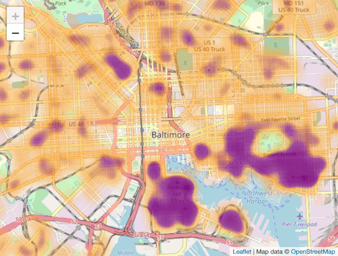
Knowing that prices rise over time, and therefore the March 2019 frame is much more purple, you can easily see some interesting changes in key Baltimore neighborhoods over the last year.
Actionable Results
So an an investor in Baltimore, how might I use this? For one, I can easily see that investors have started entering into neighborhoods I had started doing research. You can see this as a sharp change in average property values (orange to purple) as the flippers come in and do rehabs. In fact, while developing this tool, I’ve already added two neighborhoods (one near Patterson Park and another in Northwest Baltimore) to my target areas. I certainly wouldn’t use this data alone in making purchasing decisions, but it’s a great starting point.
Use the Heatmap Yourself
Since I went to all the trouble of making this tool, I figured I should let other people use it as well. The Real Estate Heatmap will show you how Baltimore property values have changed recently.
If there’s enough interest (determined by traffic), I have a few ideas of how to develop it further.
- Gather data for other major cities
- Use machine learning to predict how neighborhoods might change
- Add additional layers used in neighborhoods analysis, such as:
- Walkability
- Crime stats
- Demographics
If there does end up being a decent amount of interest, I’ll be sure to post a survey to determine which features to prioritize.