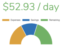
How to Create a Gauge/Meter in Vue
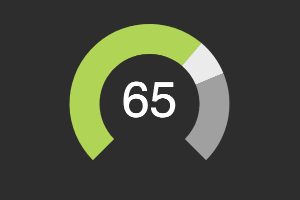
This article will show you how to create a reusable Gauge (or Meter) component in Vue. If you want to skip the details and grab the Gauge for yourself, check it out on CodeSandbox.
Features
- Support for a threshold (optional)
- Customizable range
- Animation on creation and value/threshold updates
The App Container
The application containing the Gauge is pretty basic and containing the minimum amount of information to power the Gauge. The threshold and decimals props are set here but are entirely optional.
<template>
  <div id="app">
    <div class="gauge-container">
      <gauge
        :min="min"
        :max="max"
        v-model="value"
        :threshold="threshold"
        :decimals="decimals"
      ></gauge>
    </div>
  </div>
</template>

<script>
import Gauge from "./components/Gauge"

export default {
  name: "App",

  components: { Gauge },

  data() {
    return {
      min: 0,
      max: 100,
      value: 65,
      tweenedValue: 0,
      threshold: 75,
      decimals: 0
    }
  }
}
</script>

<style lang="scss" scoped>
.gauge-container {
  width: 100%;
  max-width: 400px;
  margin-left: auto;
  margin-right: auto;
}
</style>
The Gauge Template
The Gauge’s template contains the SVG elements used to render the gauge and its label. The label uses the tweened value so that is counts up to match the animation.
<template>
  <div class="gauge-container">
    <svg
      xmlns="http://www.w3.org/2000/svg"
      xmlns:xlink="http://www.w3.org/1999/xlink"
      viewBox="0 0 100 90"
      preserveAspectRatio="xMidYMid"
      class="gauge"
    >
      <text
        :x="centerX"
        :y="centerY"
        class="value"
      >
        {{ tweenedValue.toFixed(decimals) }}
      </text>
      <path
        class="arc below-needle"
        :d="belowNeedlePathData"
      ></path>
      <path
        class="arc gap"
        :class="{ exceeding: exceeding }"
        :d="gapPathData"
      ></path>
      <path
        v-if="threshold"
        class="arc above-threshold"
        :d="aboveThresholdPathData"
      ></path>
    </svg>
  </div>
</template>
The Gauge Component
The component itself is mostly focused on SVG path generation. The math can seem a bit ugly but the important thing to note is that the computed properties use the getArchPathData() method to draw the individual shapes depending on the value, threshold, and min/max values. The beauty of the SVG path shapes being tied to the computed properties is that animation is easily accomplished using any tweening library (gsap in this case).
<script>
import gsap from 'gsap'

export default {
  props: {
    value: {
      type: Number,
      required: false,
      default: 0.5,
    },
    threshold: {
      type: Number,
      required: false,
      default: null,
    },
    min: {
      type: Number,
      required: false,
      default: 0,
    },
    max: {
      type: Number,
      required: false,
      default: 100,
    },
    decimals: {
      type: Number,
      required: false,
      default: 0
    }
  },

  data() {
    return {
      tweenedValue: null,
      realThreshold: null,
      centerX: 50,
      centerY: 50,
      innerArcRadius: 25,
      outerArcRadius: 40,
      arcStartAngle: 135,
      arcEndAngle: 405,
      animationInterval: null
    }
  },

  computed: {
    angleRange() {
      return this.arcEndAngle - this.arcStartAngle
    },

    scaledValue() {
      return ( this.tweenedValue - this.min ) / ( this.max - this.min )
    },

    scaledThreshold() {
      return ( this.realThreshold - this.min ) / ( this.max - this.min )
    },

    valueAngle() {
      let angleAdd = this.scaledValue * this.angleRange
      return this.arcStartAngle + angleAdd
    },

    thresholdAngle() {
      return this.scaledThreshold * this.angleRange + this.arcStartAngle
    },

    exceeding() {
      return this.scaledValue >= this.scaledThreshold
    },

    belowNeedlePathData() {
      if (!this.exceeding) {
        return this.getArcPathData(this.arcStartAngle, this.valueAngle)
      } else {
        return this.getArcPathData(this.arcStartAngle, this.thresholdAngle)
      }
    },

    gapPathData() {
      if (!this.exceeding) {
        return this.getArcPathData(this.valueAngle, this.thresholdAngle)
      } else {
        return this.getArcPathData(this.thresholdAngle, this.valueAngle)
      }
    },

    aboveThresholdPathData() {
      if (!this.exceeding) {
        return this.getArcPathData(this.thresholdAngle, this.arcEndAngle)
      } else {
        return this.getArcPathData(this.valueAngle, this.arcEndAngle)
      }
    },
  },

  watch: {
    value () {
      this.animateNeedle()
    },

    threshold () {
      this.setupThreshold()
      this.animateNeedle()
    }
  },

  methods: {
    getCirclePoint(radius, angle) {
      let x = this.centerX + Math.cos((angle / 180) * Math.PI) * radius
      let y = this.centerY + Math.sin((angle / 180) * Math.PI) * radius
      let xy = {
        x: x,
        y: y,
      }
      return xy
    },

    getArcPathData(angleStart, angleEnd) {
      let angleDiff = angleEnd - angleStart
      let xy = this.getCirclePoint(this.innerArcRadius, angleStart)
      let d = `M ${xy.x} ${xy.y}`
      xy = this.getCirclePoint(this.innerArcRadius, angleEnd)
      if (angleDiff < 180) {
        d += ` A ${this.innerArcRadius} ${this.innerArcRadius} 0 0 1 ${xy.x} ${xy.y}`
      } else {
        d += ` A ${this.innerArcRadius} ${this.innerArcRadius} 0 1 1 ${xy.x} ${xy.y}`
      }
      xy = this.getCirclePoint(this.outerArcRadius, angleEnd)
      d += ` L ${xy.x} ${xy.y}`
      xy = this.getCirclePoint(this.outerArcRadius, angleStart)
      if (angleDiff < 180) {
        d += ` A ${this.outerArcRadius} ${this.outerArcRadius} 0 0 0 ${xy.x} ${xy.y}`
      } else {
        d += ` A ${this.outerArcRadius} ${this.outerArcRadius} 0 1 0 ${xy.x} ${xy.y}`
      }
      xy = this.getCirclePoint(this.innerArcRadius, angleStart)
      d += ` L ${xy.x} ${xy.y}`
      return d
    },

    setupThreshold () {
      if (this.threshold === null) {
        this.realThreshold = this.max
      } else {
        this.realThreshold = this.threshold
      }
    },

    animateNeedle () {
      this.tweenedValue = this.min
      gsap.to( this, { duration: 0.5, tweenedValue: Number(this.value) || this.min } )
    }
  },

  created () {
    this.setupThreshold()
    this.animateNeedle()
  },

  destroyed () {
    if (this.animationInterval) {
      clearInterval(this.animationInterval)
    }
  }
}
</script>
The Gauge Styling
The benefit of using SVG is we can still rely on CSS for all of the styling.
<style lang="scss" scoped>
$border-color: #666;
$medium-color: #BADA55;
$bad-color: #F55;
$threshold-color: #AAA;
$gap-color: #EEE;

.gauge-container {
  position: relative;
  text-align: center;

  .gauge {
    stroke-linejoin: round;

    .value {
      fill: $border-color;
      font-size: 4vw;
      text-anchor: middle;
      font-family: sans-serif;
      dominant-baseline: middle;
    }

    .arc {
      &.below-needle {
        fill: $medium-color;
      }

      &.above-threshold {
        fill: $threshold-color;
      }

      &.gap {
        fill: $gap-color;

        &.exceeding {
          fill: $bad-color;
        }
      }
    }
  }
}
</style>
The Result
Check it out and be sure to fork and modify this Gauge for your own needs. I’ve included several basic options but some interesting next steps would be to add hover interaction or to implement more complex animations.